Alexandros Stasinopoulos – “Ora” – haute horlogerie
•January 6, 2010 • Leave a CommentArt is like masturbation. It is selfish and introverted and done for you and you alone. Design is like sex. There is someone else involved, their needs are just as important as your own, and if everything goes right, both parties are happy in the end.
— Colin Wright
Cheryl’s passion for shoes can only be matched by my love for cars. My watch fetish comes an intimately close second. Watches should not only do the practical job of telling time, but must also showcase innovation and engineering excellence. I’m less about glittering trinkets of affluence – what stokes my fire is that which is symbolic of the free-thinking artisan’s guiding philosophy. I desire the manifestation of triumph over convention.
Regardless of the intended wearer’s gender, the ideal wristwatch speaks a design language which is equal parts eloquence and spectacle when measuring every passing moment. More importantly, the mechanics of time keeping is essential theatre, obliged to be revealed, never obscured within a conventional casing if at all possible. I want to see the guts of the thing, busily translating from mechano to chrono. This explains why I prefer analogue timepieces. They are more satisfying than digital, at least to me, because they allow the artisan to demonstrate their craft in exquisite detail. The designer assumes the role of playright, the stage skillfully built to best present each component, star actors in a masterful composition of purposeful motion. Alexandros Stasinopoulos is to design as Aeschylus was to drama.
I can’t presume to know if this concept could be made real. Only a skilled watch maker could say if the design is feasible. Perhaps the belt driven display would represent a profligate use of energy. Which, if true, would be a terrible shame because “Ora” deserves to make the journey from idea to reality. And, fates willing, onto my arm.
Extreme Footwear
•December 3, 2009 • 3 CommentsContributor Cheryl Wischhover is based in New York and has much to say on the subject of shoes:
____________________________________________________________
My obsession with shoes began in quite an unlikely place: my mother’s closet. While she is an ardent feminist, a political junkie, and an unrepentent atheist, she is most decidedly NOT fashionable, nor the least bit fashion-conscious. She worked as a registered nurse when I was young, and I would watch her don her spotless white leather shoes everyday. Whenever possible I would clomp around the house in these monstrosities, enjoying the bit of lift the thick rubber sole provided. Once I hit puberty I begged and pleaded for heels, only to be stonewalled with the statement, “But Cheryl, they’re so uncomfortable.” This marked the beginning of years of arguments with my mother regarding my fashion choices (the story of my brief foray into goth, tattoos, and Doc Martens is best left for another time). My wish was finally granted, and for the occasion of my Confirmation I was allowed to buy a pair of high heels. They were eggplant leather with 2 inch stacked blonde wooden heels, and a bit of moccasin stitching along the front. I will never forget these shoes as long as I live, and I wore them all over the house, loving the height, loving the way they changed how I walked. From that point on I was a confirmed shoe junkie, and have devoured fashion magazines like a woman possessed. I could rhapsodize endlessly about the various shoe moments in my life, but the gracious owner of this blog is expecting a discussion of design, so I’d best get there…….
While handbags used to be the accessory focus for designers (“It Bag”, anyone??) shoes have not-so-quietly taken center stage in the past few seasons. Heels have steadily gotten higher, with 5 inch heels now the norm. I have indulged in a bit of schadenfreude and watched rather gleefully as one willowy gamine after another has toppled on runways because of these exquisite yet impractical creations. Height is not the only aspect that designers have been pushing. Embellishment has become more fanciful, proportion is skewed, and tasteful restraint is nowhere in existence. Many have theorized that designers are rebelling against the current depressing economic environment and doing what fashion does best: providing a fantasy, an escape from a mundane existence, and ultimately, mood enhancement. The architectural, emblazoned, bejeweled beauties that follow are the stuff of fairy tales, and art in their own right. Most importantly, they are damn fun.
Alexander McQueen, Spring 2010
Alexander McQueen is British-born and looks more like a soccer hooligan than a fashion designer. His Brit fashion cred is impressive, having worked on Savile Row at the age of 16, as a costumier into his 20s, and finally completing a Master’s in Fashion Design from St. Martin’s. Many heralded his Spring 2010 show as the standout of the season. I personally found the clothes inaccessible and garish, but the SHOES….my mouth was agape. Witness for yourself:
Of note, these shoes are 10+inches in height, a record everywhere, except possibly the world of shoe fetishism. The so-called lobster claw shoes garnered the most attention. I think they look hoof-like, and quite otherworldly. The mirrored mosaic pair are my favorite of the group. The hoof shoes were also shown in technicolor snakeskin, and battered leather with thick metal plates. They completely transformed how the models walked, into a careful lope that was not quite human. The metallic aqua stunners in the center look fluid and amorphous, like ectoplasm that could shape-shift at any moment.
Olivier Theyskens for Nina Ricci, Fall 2009
Olivier Theyskens is a Belgian-born designer who reportedly wanted to be allowed to wear princess dresses as a child. (He certainly is one of the prettier men I’ve seen, mustache and all.) He dropped out of fashion school after a few years and put out an eponymous collection. He then designed for the now-defunct Rochas line to much acclaim, and is currently at Nina Ricci, where it is rumored that it will be his last year with the house.
The shoes that Theyskens sent down the runway for Fall 2009 have a unique feature. Actually, they are MISSING a feature:
While some of the shoes sported a spindly heel in the back, it was for show only and came nowhere near providing stability (or even touching the ground for that matter). Gaudily decorated in glitter and satin and shine, these heelless shoes are sculptural, strong, architectural. Amazingly, no models fell on the runway. Apparently they are weighted heavily in the front and provide counter-balance. However, they require that one walk on her toes the entire time without leaning forward or backward. Those of us for whom grace and balance is an issue, proceed with caution. Despite the avant-garde sensibility of these, there is a slight tranny feel to them that is appealing. Tongue-in-cheek by Theyskens, perhaps.
John Galliano Spring 2010
John Galliano is one of my favorites, always sporting a rakish little mustache and with a penchant for wearing pirate-inspired gear on his runways. He was born in Gibraltar (does that make him Gibraltan? Gibraltese? Gibraltaresque? No matter….) and he is a graduate of St.Martin’s in London. He has designed for Givenchy and is currently the creative director of Christian Dior. He still also does an eponymous line, and thank goodness, for look at the fruits of his labor:
While possibly not as kooky and unique as the previous examples, I could not exclude them. I sigh with pleasure at the sheer unabashed girliness of these shoes. Those dainty gumball pearly heels look like they could snap off. The juxtaposition of the little nuggety heels with the tough, heavy platform in the front is inspired. And the ornamentation! I’m swooning. Bows and satin and dotted swiss and feathers all on one shoe? I need to get my hands on these, if only to try on briefly. Pardon my gushing, but these shoes are aesthetic perfection.
Shoes of course serve a practical purpose, of which I don’t think much explanation is required. However (and this is directed at those with an XY chromosome) they can be transformative. They sculpt a woman’s legs into a masterpiece of lines and musculature and curves. They require a certain confidence and physical prowess. They are marvels of engineering, artistry, and design. So when my mother asks me (as invariably happens when I show up somewhere with yet another new pair of shoes) “Cheryl, do you really need more shoes?” my reply is always, “Hell, yes.”
Carlos Jiménez Cahua – Lima series
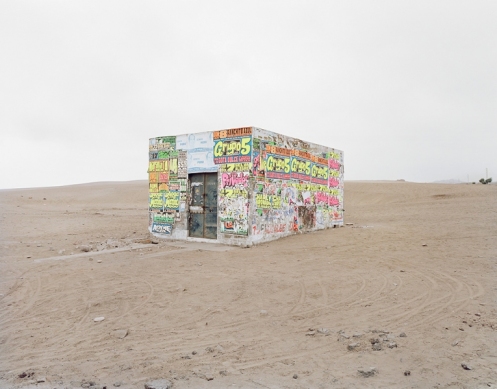
•November 10, 2009 • Leave a CommentPeruvian born Carlos Jiménez Cahua grew up in the US, but a large part of his creative soul belongs, judging by his choice of photographic subjects, to the place of his birth. Most striking is the series ‘Lima’. His images are of an eerily unpopulated city-scape, where urban sprawl has spread into the desert. Sky, city and earth blend together indistinctly, the faded pallette almost devoid of colour. Any evidence of strong hues is then accentuated by contrast, as in the following two examples:
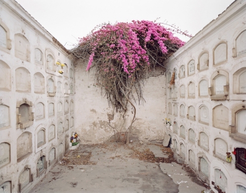
A favourite of mine is this remarkable assemblage of structures – a box-tower necropolis seemingly extruded from the soil.
The Lima of Jiménez Cahua is functional, shabby, it’s relationship with the desert uncomplicated and humble. To my eye it appears to have blown in from a former location. Then hastily erected and inhabited by a legion of ghosts invisible to the camera. Through the haze emerges a place that aims to make no bold statement, but does so anyway, a stubborn monument to sheer necessity, pushed up from the dirt by a resilient spirit.
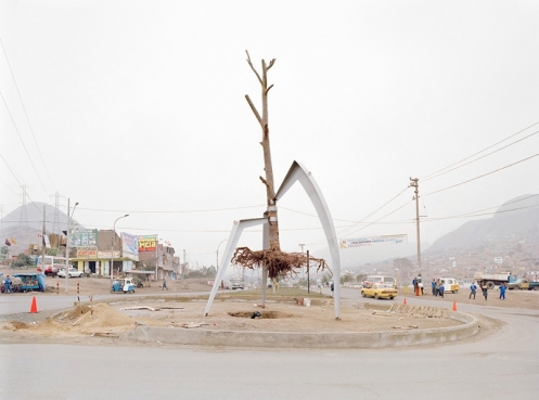
Again, the dead appear to have more impact on the landscape than the living:
This has to be the most captivating piece of civic art I’ve laid eyes on. Or is it simply a tree about to be planted in the middle of a roundabout? Wonderful either way.
The words of Peruvian César Vallejo, one of the most innovative poets of the modern age, are appropriate companions to the photography. Extracted from “I AM GOING TO SPEAK OF HOPE”
– No one lives in the house anymore – you tell me -; all have gone. The living room, the bedroom, the patio, are deserted. No one remains any longer, since everyone has departed.And I say to you: When someone leaves, someone remains. The point through which a man passed, is no longer empty. The only place that is empty, with human solitude, is that through which no man has passed. New houses are deader than old ones, for their walls are of stone or steel, but not of men. A house comes into the world, not when people finish building it, but when they begin to inhabit it. A house lives only off men, like a tomb. That is why there is an irresistible resemblance between a house and a tomb. Except that the house is nourished by the life of man, while the tomb is nourished by the death of man. That is why the first is standing, while the second is laid out.
Andrew Crane
•September 11, 2009 • Leave a CommentWhen viewing an art work, preferably without understanding the artist’s intention, I draw upon my experiences, my philosophy and ultimately my instinct. Does it feel right to me? What does it invoke? The power of art is in our personal relationship with it (yikes…cliché).
Andrew first came to my attention through Twitter. This fortuitous connection should be sufficient to promote the merits of that much maligned (by those who fail to understand it) social messaging facility. From there I discovered his blog, and his art.
I could wax lyrical and fill pages with what attracts me to Andrew’s artwork – but you’ll lose interest and browse away, and I’ll have squandered my opportunity to present one person’s rare creative output, but also wasted a chance to say something indirectly about little ol’ me.
Over a period of weeks I’ve taken time to sit and simply consider each of his paintings. Sadly, the electronic medium in it’s current form is not able to reveal the full palette, nor the textural qualities of the art. Better I see them first-hand, able to appreciate the use of oil, cement and canvas. However, such is the efficacy of Andrew’s communication to the observer, that even when admired ‘over the wire’, I’m left enthralled.
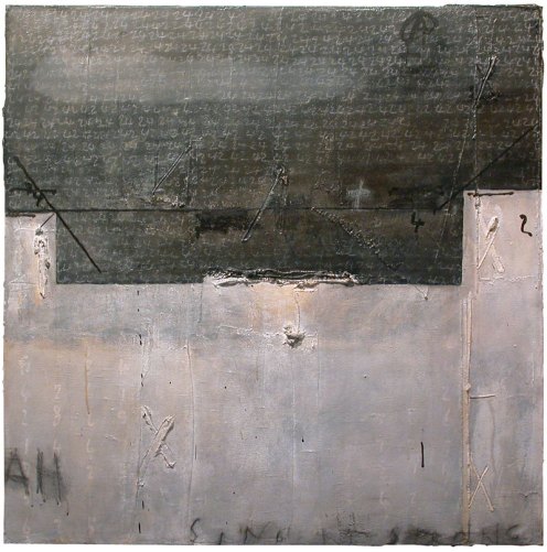
Consider the example below. It’s first for a reason. I’m a rational person who makes sense of the world using reason and I value science for it’s key role in the pursuit of truth. My interpretation: how mathematics – numbers – underpins our understanding of all reality. Here the boilerplate cladding of spacetime has fallen away to reveal that relationship. (HGTTG fans take special note of the number 42.)
#2 I’m attracted the simplicity of this work. I like to imagine hidden behind that forbidding concrete facade, labelled “Un-known”, is the answer to many questions – potential access to an unlimited store of knowledge, or an unraveling of important personal or cultural mysteries. Perhaps the key to unlocking the vault is through the spatial relationship between the numbers scrawled over the canvas . Quite possibily it’s the other way around – what remains after all knowledge has been lost. To go one step further into my personal life: For many years I thought I knew someone close and dear to me, only to discover recently I really didn’t have a clue. The cold water shock of being confronted with that truth is symbolised below.
#3 Using “Un-known” as a precursor, I will lead you swiftly on to the next of Andrew’s intriguing works. From what I didn’t know, to what I think I know. Here the relationship between one learning, and one teaching, not through the normal modes of communication. For me, sometimes the most effective lessons are taught by what is left unsaid, if only the student is perceptive enough to notice. So many are not.
#4 Again, for me, this next one is about hidden qualities and mysteries. What is apparent to the observer is not all – an obelisk will extend some way into the ground. Or could this be a cross-section of a Mayan pyramid, depicting the central shaft dropping into the earth. As with so many of Andrew’s paintings, numbers are ever present. More mysteries. Angles? Astronomical references? Ciphers? Plenty to chew on. Much to stimulate the intellect. This is the job of art, and the artist.
The Sartorialist
•June 24, 2009 • Leave a CommentEnvy is not a positive force in anyone’s life. As I browse the photographs of Scott Schuman’s popular street-fashion blog I am inevitably consumed by it. Scott originally started The Sartorialist to share photos of fashionable people he saw on the streets of NYC. The scope of his attentions later extended to fashion hotspots around the world, including Paris, Milan and Florence.
The subjects all share one thing, transcending age, gender or class: an innate sense of personal style – hence the source of my envy – I have almost none. Schuman’s aim is to draw inspiration from them, sometimes focusing more on individual elements as opposed to the complete ensemble. The photographs, Scott’s commentary, combined with comments from the blog’s fashionista audience provide unschooled types like me with a valuable guide to expressing our own particular brand of style.
I’ll never be brave or motivated enough to match some of the more eccentric looks captured by the Sartorialist photographers, but I can take cues to come up with something that expresses my casual, anti-elitist perspective.
Beauty
•May 8, 2009 • Leave a CommentA very beautiful advertisement.
Gucci “Flora”
The model is Australian Abbey Lee Kershaw, the commercial by British video & film director Chris Cunningham.


